The colors in your home don’t just decorate—they affect how you feel. Some hues energize, some calm, and others inspire creativity. By understanding color psychology, you can choose wall art that enhances your mood and complements your space. This guide breaks down each major color, its emotional impact, and tips for using it in wall art.
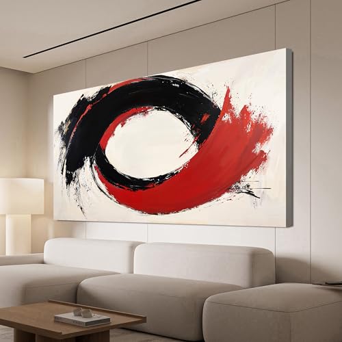
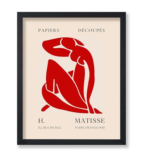
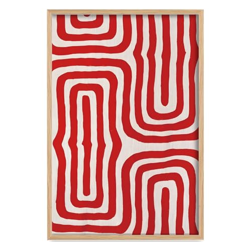
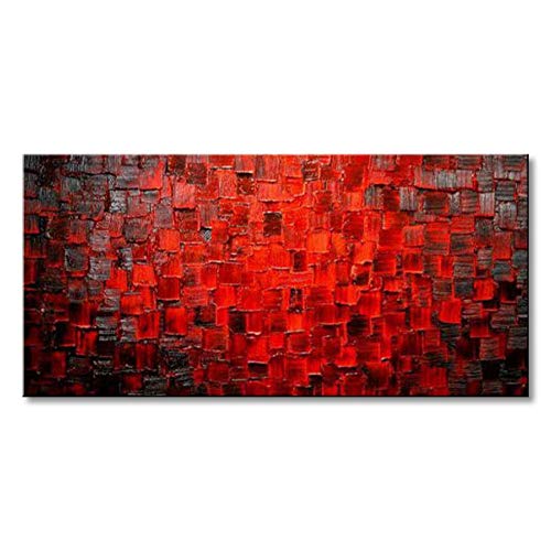
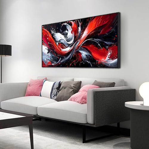
1. Red: Energy, Passion, and Attention
- Emotional Impact: Red grabs attention, stimulates energy, and encourages conversation. It’s bold and exciting.
- Best For: Living rooms, kitchens, or social spaces.
- Wall Art Spot: Place a bold red abstract or floral print as a focal point above a sofa, console, or dining table.
- Tips for Using Red Art:
- Pair with neutral walls to prevent overwhelming the room.
- Use in small doses in offices or bedrooms to avoid overstimulation.
- Accent red pieces with black, gold, or white frames to enhance drama.
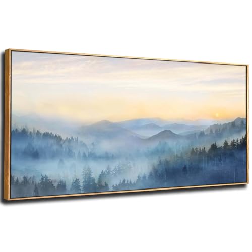
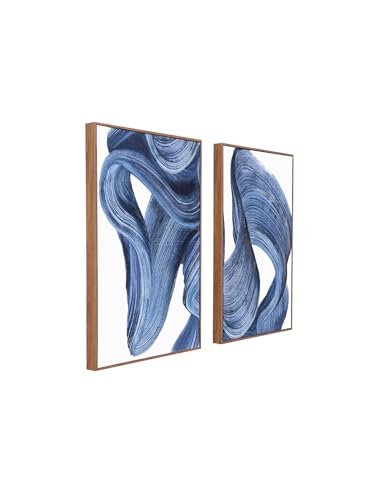
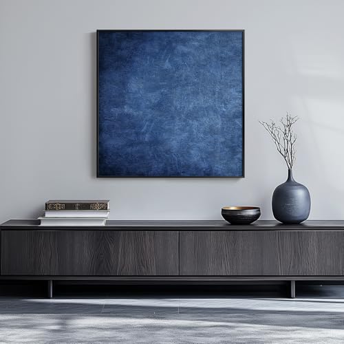
2. Blue: Calm, Focused, and Trustworthy
- Emotional Impact: Blue lowers stress, promotes focus, and fosters a sense of stability. Light blues feel airy and refreshing, while darker shades feel grounding.
- Best For: Bedrooms, bathrooms, or home offices.
- Wall Art Spot: Hang an ocean landscape, sky abstract, or minimalist blue geometric canvas behind a bed or desk.
- Tips for Using Blue Art:
- Combine with white or neutral accents for a serene look.
- Use darker blues in large rooms to create coziness.
- Pair with small warm accents (like gold or orange) to prevent coldness.
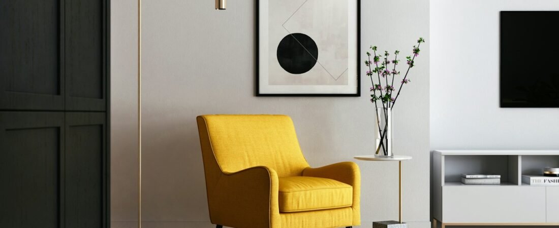
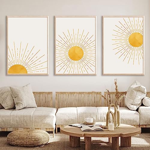
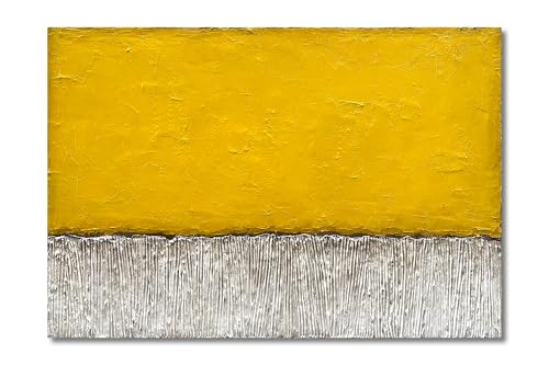
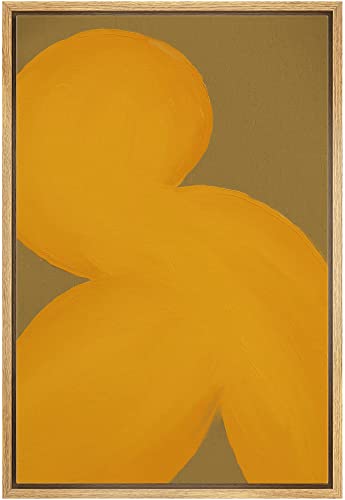
3. Yellow: Happiness, Optimism, and Creativity
- Emotional Impact: Yellow energizes and uplifts, sparking optimism and creativity. Overuse can feel overwhelming, so balance is key.
- Best For: Kitchens, dining areas, or creative spaces like studios.
- Wall Art Spot: Bright abstract pieces or sun-inspired prints can draw attention and lighten up a corner.
- Tips for Using Yellow Art:
- Mix yellow with neutral backgrounds to avoid visual fatigue.
- Use in small wall clusters or gallery walls to create a playful feel.
- Pair with complementary blues to create a dynamic contrast.


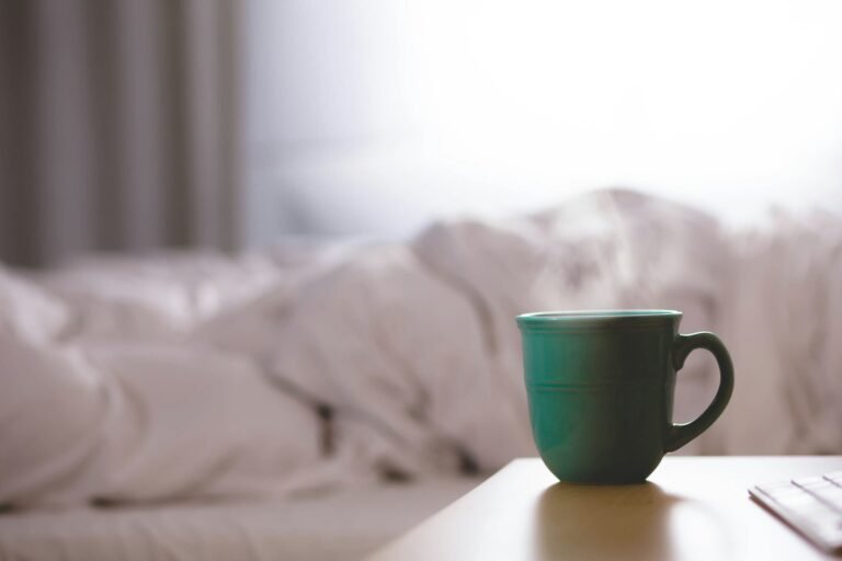
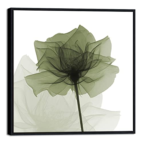
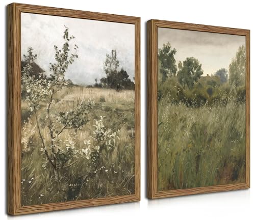
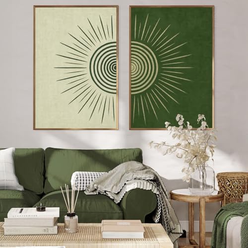
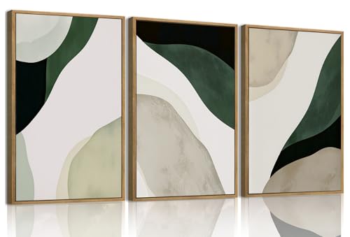
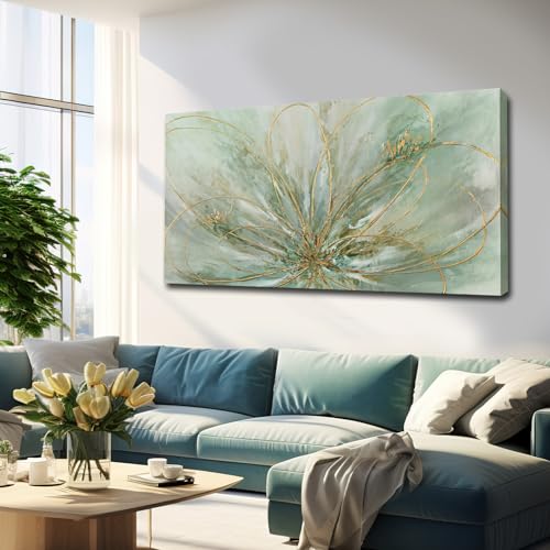
4. Green: Balance, Renewal, and Calm
- Emotional Impact: Green evokes nature, growth, and balance. It’s refreshing, reduces stress, and creates harmony.
- Best For: Living rooms, home offices, or bedrooms for relaxation.
- Wall Art Spot: Botanical prints, forest landscapes, or abstract green canvases bring a natural touch indoors.
- Tips for Using Green Art:
- Pair with neutral furniture for a grounded, earthy vibe.
- Layer multiple shades of green for depth in a gallery wall.
- Combine with wood textures to enhance a natural atmosphere.
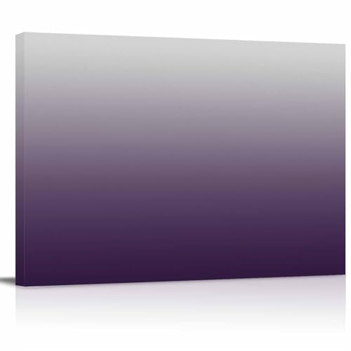
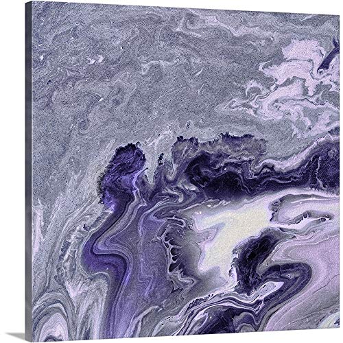
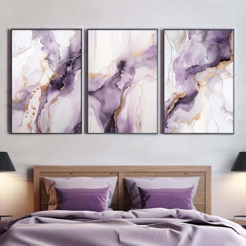
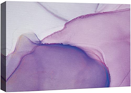
5. Purple: Luxury, Creativity, and Calm Sophistication
- Emotional Impact: Purple inspires creativity, evokes luxury, and balances calm and drama. Light lavenders are soothing; deep purples are more dramatic.
- Best For: Bedrooms, creative spaces, or studios.
- Wall Art Spot: Place lavender abstracts or deep violet florals above a desk, reading nook, or bed.
- Tips for Using Purple Art:
- Pair light purples with soft neutrals to create a dreamy effect.
- Use deep purples in small accent pieces for sophistication without overwhelming.
- Combine with gold or brass frames to enhance luxury.

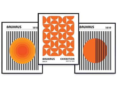
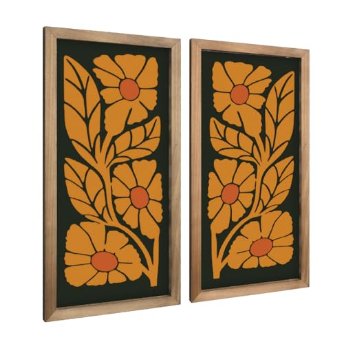
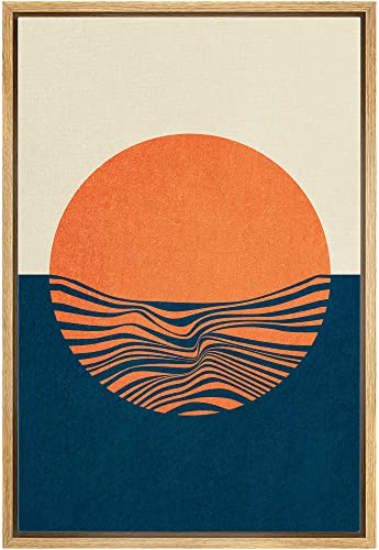
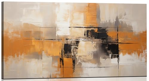
6. Orange: Excitement, Warmth, and Sociability
- Emotional Impact: Orange stimulates energy, excitement, and sociability. Warm and inviting, it encourages interaction.
- Best For: Dining rooms, living rooms, or entertainment areas.
- Wall Art Spot: Bold orange abstracts, geometric prints, or landscapes with warm tones can make a room feel vibrant.
- Tips for Using Orange Art:
- Pair with cooler neutrals to balance energy.
- Use smaller art pieces if your room is already bright or warm-toned.
- Cluster orange with complementary colors like blues or greens for visual pop.

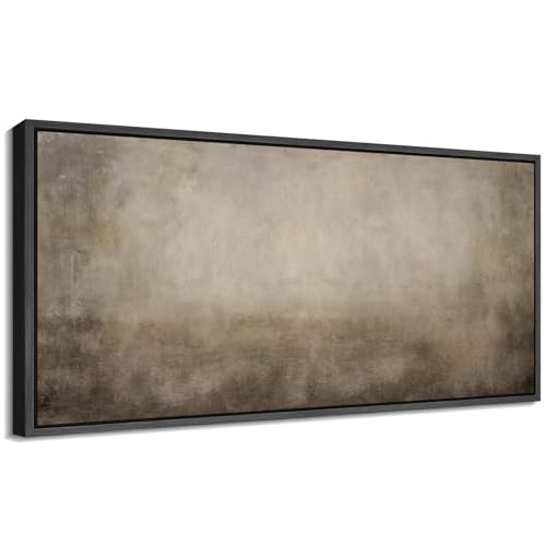
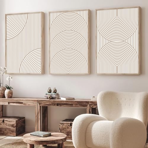
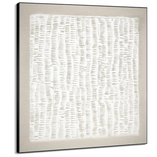
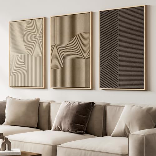
7. Neutral Colors (Black, White, Gray, Beige): Balance and Versatility
- Emotional Impact: Neutral colors provide balance and calm. They act as a backdrop for other colors and allow vibrant wall art to stand out.
- Best For: Any room—works with bold or muted wall art.
- Wall Art Spot: Black-and-white photography, monochrome abstracts, or beige-textured canvases create timeless, versatile statements.
- Tips for Using Neutral Art:
- Use neutral wall art to tie together multiple color accents in a room.
- Mix textures (canvas, metal, wood) to add depth.
- Pair with bright accent pieces to create contrast without clutter.

Extra Tips for Choosing Mood-Boosting Wall Art
- Layer colors: Combine a dominant color with subtle accents to create depth.
- Balance warm and cool tones: For lively energy, add warm accent art; for calm, focus on cool tones.
- Consider room function: Match art color with purpose: energizing in social spaces, calming in bedrooms.
- Pay attention to placement: Eye-level hanging ensures art makes an impact without overwhelming.
Bottom Line
The right wall art can transform the mood of any room. Understanding the emotional effects of color allows you to pick pieces that energize, calm, inspire, or balance your space. With a thoughtful combination of hues, saturation, and placement, your walls can become a visual and emotional centerpiece of your home.
🌿 Disclaimer: Some of the links in this post are affiliate links. I may earn a small commission at no extra cost to you if you make a purchase. Prices are accurate at the time of posting and may change.
Recommended For You
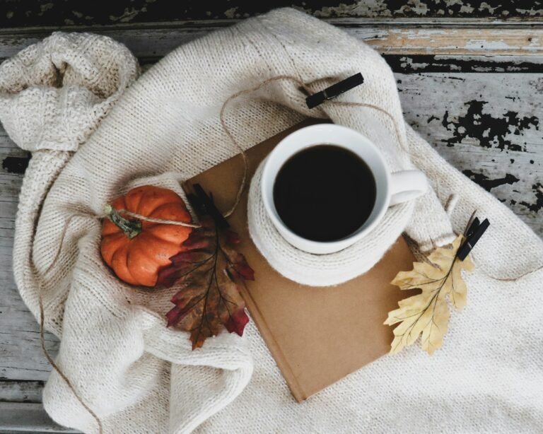
Bring Autumn Home: Stunning Centerpieces You Can Order Today
Create a Dreamy Bedroom Vanity You’ll Actually Love
The Most Charming Crock-Pots You Didn’t Know You Needed
Halloween Made Easy: Build the Cutest Boo Baskets Ever
Cozy Up: The Best Blankets and Throws for Fall 2025
How to Restart Your Life Today: 5 Simple Steps to Begin Again
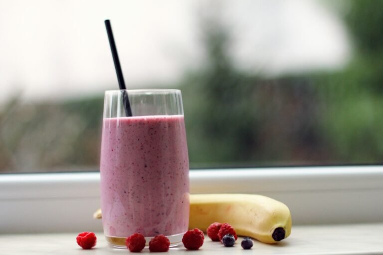
Easy Anti-Inflammatory Breakfasts: Go To Morning Recipes
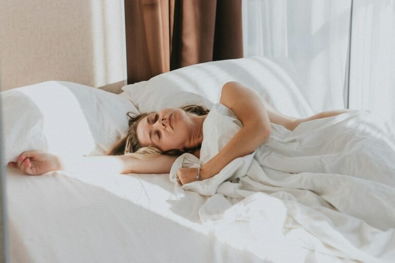
Better Sleep Made Simple: Actionable, Science-Backed Strategies